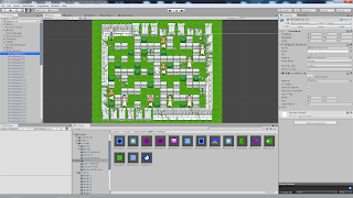
The interface of Unity Engine, and overall objects and elements used in PPG
Work on the CG sets is almost complete, so as I transition into making the final adjustments to the new bonus stages I'll talk a bit about how was my planning process for creating the game's original levels.
The initial scope was simple: create 5 different stages with 7 levels each. Each stage would have a specific overall theme and gimmick. Very early I had decided to have those exact number so as to keep the goal of finishing development realistic for an amateur game developer. While on paper this plan sounds simple enough, the execution could have been better.
Stage 1 was the eponymous Pixie's Garden, with symmetric patterns
The first stage should have been more streamlined and easier, so that the player could get used to the controls and gameplay mechanics. But instead I created a huge difficulty spike with the introduction of flowers on level 1-3. Since the theme was her own backyard, the gimmick of not destroying the flowers makes sense in that context, but it introduces to the player a mechanic that is directly opposed to the main core gameplay (destroying everything) way too soon.
I didn't perceive this mistake because at a certain point, I was too good at my own game so the difficulty spike was invisible to me when I was playtesting. To avoid this mistake, I should have had beta testers play the game in earlier stages of the development.
Stage 2 was the underground from where the monsters attacked the garden
For this stage, I designed the levels to be messy to reflect the cavern theme. Half the gimmick is this messy pattern with the intention of trowing off the players perception of the game grid and the explosion range. The other half of the gimmick are the 2 enemies themselves, where both can move trough the mushroom blocks putting more pressure on the player. I was mostly satisfied with this stage, but in terms of mechanics I think 1 of the enemies should have had a different set of skills.
Stage 3 are ancient ruins. A portal between Pixie's world and the monster world
Here I wanted to rise the difficulty and keep the player constantly moving in the maze-like pattern. The huntress enemy does this with with her spinning attack, moving towards the player. The satyr with his long range skill forces the player to be conscious of bomb placement as well. The hidden breakable blocks helps with that feeling of urgency.
Stage 4 - The tower fortress, home of nefarious magic experiments
Another huge difficulty spike in this stage, due to many mistakes: the zombie enemy taking 3 hits was too strong, the levels didn't have much margin for error and the timer was running out, sorceress used the homing magic too frequently, etc. This one was a mess. The mistake that I made here (which I also made elsewhere, but was mostly noticeable on this stage) was that I designed each level in a vacuum, without taking into consideration the challenges of previous and subsequent levels.
I play tested the difficulty in "debug mode" where I had extra lives and powers, whereas I should have taken into consideration that the player would be coming into the stage with few lives and little power. Again, another mistake that could have been avoided had I the help of beta testers.
Stage 5 - The imperial castle, where the invasion leader rules the land
The theme for this one was that all the enemies and gimmicks from previous stages would combine into the game's end challenge. But that turned out to be way too hard on the player. I should have toned down on enemy spawn frequency and made the levels more open. Also, I went way too crazy on the design of the last boss, she is too overpowered. her design is cool, but I didn't take into consideration that the player would be arriving on the last level with low resources, coming from all the difficult stage 5 previous levels.
After I released the game, there was mostly only one big criticism about the game, and it was the hard difficulty. With the feedback of so many players, I finally realized the mistakes that blind sided me during development and created the version 1.1 update, where I included an "easy mode" and many fixes to overall difficulty of some levels and enemies.
But even then, the game remained hard, and that is because I made other mistakes in core gameplay mechanics of the game. One of them is that it is too punishing for the player to lose a life in just 1 hit. Since I designed the whole game around that formula, changing it so late in the game's life would break more things, so it would not be worth it.
To conclude, as expected of a first time game developer I made many dumb mistakes. I'm fully aware of them and take full responsibility for it. But this was a good learning process and for my future projects this experience will help me create better games.
Thank you very much for reading. Until next time!


Really interesting read and good to see you learning from your experiences with this game. I'll be looking forward to your next game! And for v1.2, for that matter! Any guess as to when it'll go live?
ReplyDeleteWith my current pace, I think the later half of august, from the 15th onward is looking very likely for the release!
Delete